Art zone
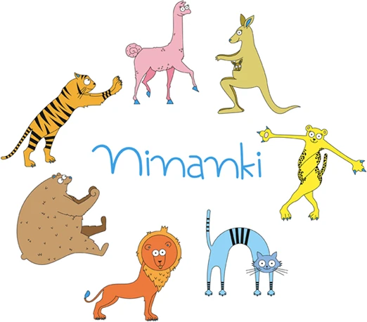
Ninanki are full of colours, which are filled with animations and drawings and stimulate children's imagination. Each colour assigned to a given animal has a meaning in coding information about movement patterns by children.
"Colors are music for the eyes because they can be put together like notes"
Eugène DelacroixThe visual arts play an important role in the development of preschool children.
They help them to appreciate the aesthetic qualities of the world around them, discover the beauty of nature and experience it more deeply. Through art, children learn to observe carefully, develop sensitivity and learn to express their emotions through creativity.
About colors...
When talking about colours, one cannot forget about the most important factor, namely light.
Seeing colour is part of the radiation reflected from the surface of an object that reaches the eyes. Light gives colours depth, losing or enriching their intensity. A given colour takes on different shades, which depend on the amount of light and the distance from which it reaches the colour. This is because we are talking about the space necessary for the correct perception of colour. The same is true of movement, which is light giving space to the body, which needs to find its place in its surroundings. Building body awareness and a sense of the weight of movement means giving it the right brightness.

Ninanki colours – more than just aesthetics
The colours used in the Ninanki programme are more than just graphic elements – they are the language we use to communicate the values of our foundation. Each colour has its own purpose and character, creating a consistent and recognisable visual identity.
Ninanki Blue
This is our signature colour – present in both versions of the logo and as a detail in each character. It symbolises the Ninanki foundation and its mission. It should be the first choice in colour schemes, especially where the colour palette is limited.
Ninanki Black
It is an elegant, broken black, ideal for official materials and longer texts. We also use it in character outlines. The carefully selected shade harmonises with the pastel tones of the other colours, ensuring visual consistency.

Colours of the characters
Each of Ninanki's animal characters has its own unique colour.
It is their calling card and distinguishing feature in graphic materials, bringing the world of Ninanki to life and giving it individual character. All colours in our system have been designed with harmony, accessibility and positive emotions in mind, to support the foundation's mission at every level of communication.
